Sunday, December 5, 2010

Field Journal 9: The Psychedelic Style and Moscoso

       When discussing the poster mania of the 1960s and the psychedelic poster movement which captured the sentiment of the time period, it appears that almost all of the designers who practiced the style were self-taught, yet only one of the major artists, Victor Moscoso (b. 1936), had formal art training, and in my opinion, his art work is some of the best of the era due to his vibrant style.


What is the Psychedelic Style?


A poster by Wes Wilson, the godfather of psychedelic art.
http://www.lysator.liu.se/~wizkid/art/psychposters/
       The brief psychedelic style and graphics movement of the 1960s was representative of a time of war, civil rights, and social activism. Due to these issues, it was only appropriate that a new type of art style emerged onto the graphic design scene, and it had a great effect on those who observed it, for “respectable and intelligent businessmen were unable to comprehend the lettering on these posters”; whereas, “as younger generation…deciphered, rather than read, the message” on these posters (438). The complexity and design of these posters drew inspiration from art nouveau, the brief op-art movement, and the “recycling of images from popular culture or by manipulation” (438). These techniques were obviously a departure from the traditional printing styles and the result was a completely fresh style which defined an era. The works found during this time are highly entertaining and visually appealing as one‟s eyes are drawn into and seemingly trace the sinuous curves while being stimulated and excited by the vibrant colors.


Source: Meggs, Phillip B. and Purvis, Alston W. Meggs’ History of Graphic Design 4th ed. Hoboken, New Jersey: John Wiley & Sons, Inc., 2006


Who is Victor Moscoso, and what did he contribute to the psychedelic movement?


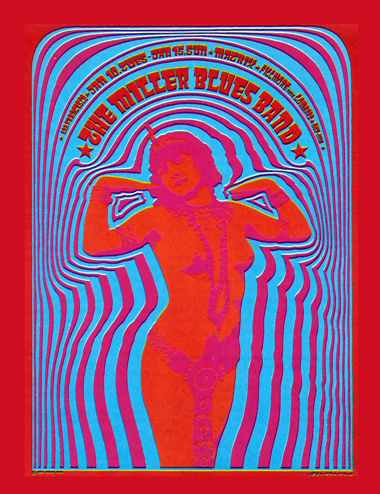
The Miller Blues Band, Moscoso 1968
      Our book devotes a couple of sentences to Moscoso, so I decided to investigate further. Victor Moscoso was born in Spain in 1968, and he grew up in America in Brooklyn, New York. Unlike Robert Wesley “Wes” Wilson who seemingly stumbled into the art scene after high school, Victor knew at an early age that he had an interest in art and pursued it at Yale after graduating from Cooper Union. Joseph Albers, a modern colorist at Yale, was friend of Moscoso and the two studied together. This relationship and studying together would later prove to be invaluable to Moscoso as he took what he had learned with him to the Art Institute of San Francisco in 1959 where he acquired his MFA degree. This move shows that Moscoso was at the right place at the right time just as the psychedelic movement was born in the same region. Later, Moscoso designed promotional posters once the movement picked up for the Family Dog, an organization which promoted dance shows.


Link: Moscoso and Psychedelic Posters


      Moscoso's contributions to the psychedelic movement reaffirmed the resources which the movement used and also took them to a new level in my opinion because the pieces he created are highly jarring visually and very eye-catching due to their extremely vibrant colors.


The Chambers Bros, Moscoso
Vibrating Colors
       “Victor uses the concept of vibrating colors to create the 'psychedelic' effect in many of his pieces.
The vibration is achieved by taking colors from the opposite end of the color wheel, each one having equal value (dark to light) and intensity (brightness). An example is red and green.
Because there is no break between the colors, your eye does not know which one to focus on as the colors 'compete'. This effect only happens along the edges where these colors touch. Special inks are not needed and Victor uses standard printing inks for his work.
Vibrating colors should not be confused with neon or fluorescent colors, as these are entirely different color techniques, none of which are used by Victor.”


Source: http://www.victormoscoso.com/aboutvictor.html


Sphinxdance, Moscoso
       This definition of vibrating colors was exactly what my teacher in a design course I took last semester explained and can be seen on the right picture in the lenses of the woman‟s sunglasses where the vibrant blue and pinkish hues sort of clash creating an interesting effect around the edges of the font. This is also relatable to the op-art style which is associated with this optical color vibration.


Link: More Examples of Moscoso's Work

No comments:

Post a Comment